commission for
Nightingale Hospital
april 2024

'Balance' (2024) Watercolour and gouache on Arches Aquarelle 300gsm paper 80 x 52 cm On display in Nightingale Hospital, Edward House Centre
'Exploring Possibilites' (2024) Watercolour on Fabriano 300gsm paper 45 x 62 cm On Display in Nightingale Hospital Bell Street Centre
'After the Storm' (2024) Watercolour on Arches Aquarelle 300gsm paper 111 x 74 cm On display at Nightingale Hospital Bell Street therapy centre

'A Clearing' (2024) Watercolour on Arches Aquarelle 300gsm paper 108 x 73 cm On display in Nightingale Hospital Main Reception
In February 2024, Nightingale Hospital approached me to make a series of paintings for their therapy centres in Marylebone, London. Nightingale Hospital is the only private hospital in London dedicated to adult mental health, offering treatments for eating disorders and addiction. They had seen my Mindscapes series from 2021 - a personal exploration of painting as a therapeutic tool - and had asked me to create a set of abstract watercolours based around a theme of hope & recovery. Knowing that these paintings would be seen by people at various stages in their recovery made it a daunting task, but one I was determined to do absolute justice. This journal will reveal my whole process, from preparatory sketches to finished final paintings, using some extracts from my personal diary kept during the project.
Exploring Possibilities
In the very early stage of my process, I adopted a technique which I used a lot when making my Mindscapes in 2021 where I would try to abandon all expectation of the outcome, and instinctively apply paint and colour to the page. This is the kind of approach that I take when I’m not yet sure what direction I will go in. It is a method I have used a lot when I have felt low since I don’t have to think too much about what I’m doing; I can just enjoy the way the watercolours run into each other.
At times this method can be more difficult than having an end product to aim for, but the idea was to allow myself to create without fear of getting it wrong. I instead created a little world for myself, enclosed within my sketchbooks, where mistakes are welcomed. If I ever felt frustrated by it, then I could just close the book, or move on to something else. The great thing about making abstract art is that there is no definitive measure of how ‘right’ or ‘wrong’ it is.
When approaching this commission I made a lot of preparatory sketches, many of them I didn’t like at all, but it was necessary to let the mistakes happen and get closer to creating the larger paintings that Nightingale had asked me for. I continually revisited my little sketchbooks, painting intuitively throughout the duration of this commission, to take some pressure off when I felt daunted by the huge pages in front of me.

Sunday 17th March 2024
“I need to allow myself to be free to make mistakes, but make them seem intentional, even highlight them if necessary. Making mistakes look beautiful is actually something I’m good at.
The other anxiety often arising is about speaking about my recovery, I’m not sure if you’re ever really ‘recovered’, but I’m definitely not in the thick of it anymore. The depression I experienced 2-3 years ago is not me anymore, and therefore these will be the paintings of someone who was living with severe depression (as a doctor once described me), and not necessarily someone people could relate to here and now. The expert in the field of one’s own struggles is the individual and little to no-one else - that can be lonely. So these paintings need to provide a space for escape, momentary comfort and maybe even stimulate conversation.
Someone might have 10 years of experience getting the tube to work every day, but for the last 10 years they’ve been taking their car to work instead - does that mean that he or she knows what it’s like to get the tube to work now? If someone asked them to write an essay about tube travel, would they be the best qualified to speak on the matter?”


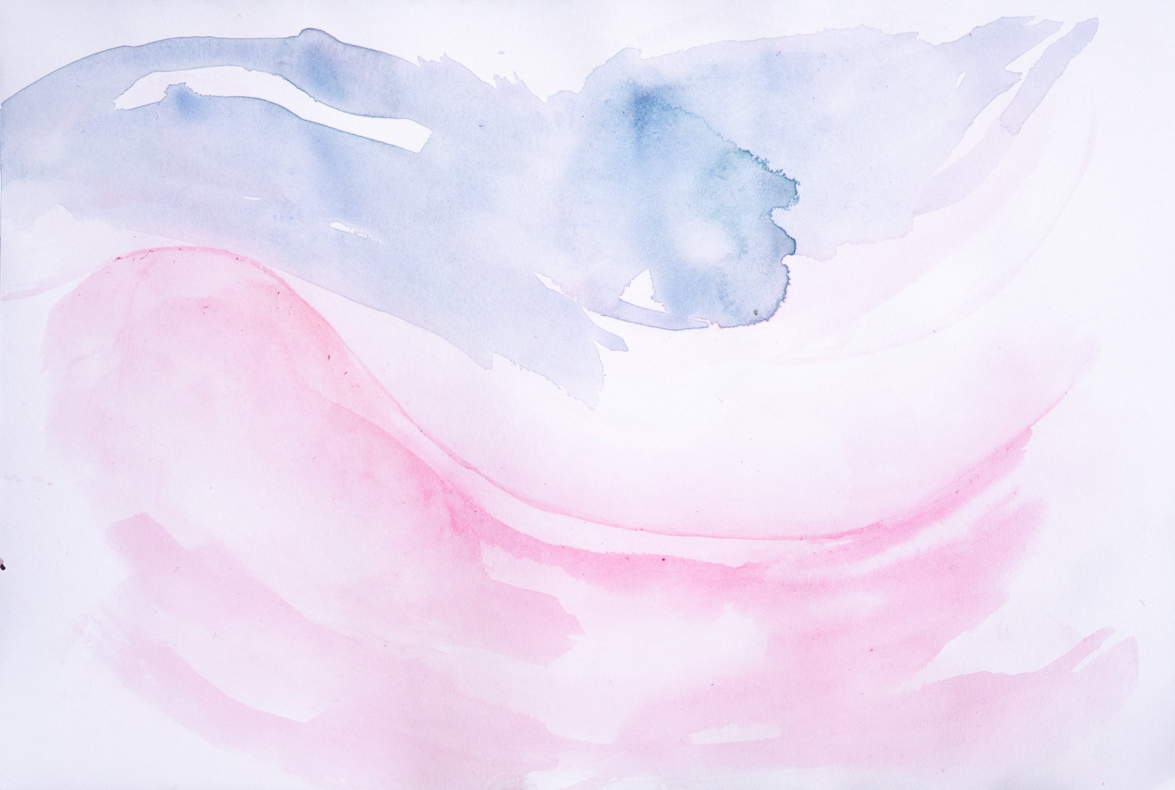


Finding Balance
After getting through some initial anxiety and settling on colour palettes for each painting, I moved on to making some larger paintings. This allowed me to see how the colours looked when they were spread across a larger area, and how they performed on different types of paper. At this stage, I was trying to find form and movement within the pools of paint.
When I make abstract paintings, I am trying to find a balance on the page without being restricted to making it symmetrical. Mistakes are inevitable in this process, but I can find a way to correct or counter them with another mark.
I could push the possibilities to the absolute extreme, each time thinking about how I could improve on it - trying to find a comfortable balance within the composition. It’s a bit like refining the quantities of ingredients for a recipe, and I was making the paintings to suit my taste.
Something I’ve learnt through many years of painting is that everyone has different tastes; some of my paintings that I am most critical of can end up being the ones that other people really admire.


Balance (2024)
Watercolour and gouache on Arches Aquarelle 300gsm paper
80 x 52 cm
On display in Nightingale Hospital, Edward House Centre


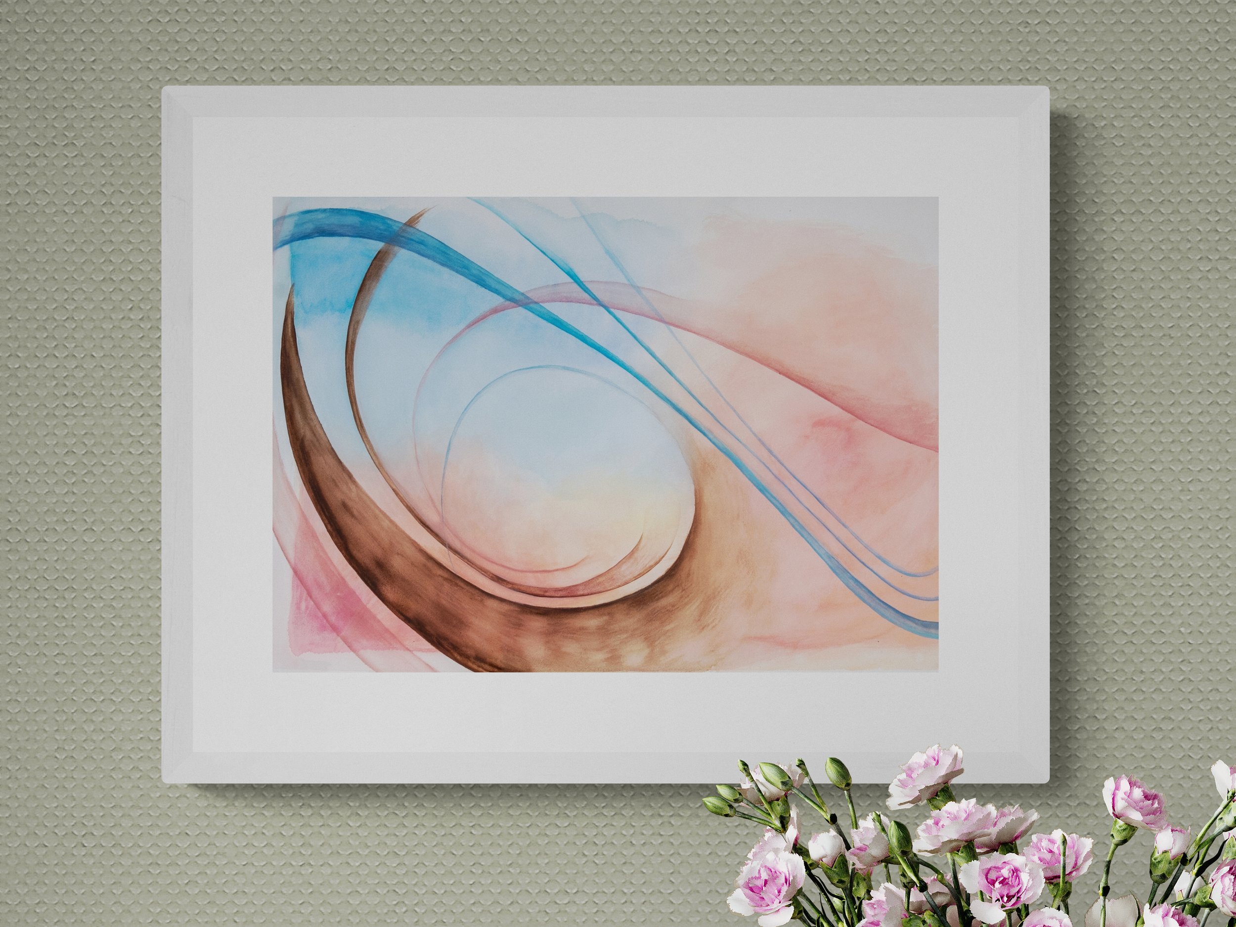
Bringing the outside in
As I continued my exploration, I was trying to conceive a narrative that would connect all the commissioned paintings. I decided to begin in my comfort zone, depicting the natural landscape.
In the ‘Balance’ paintings, I was using blue and pink colours but trying to avoid them mixing into purple. But this time, I could allow the blue and yellow paints to run into each other to make green and I found it much more freeing and enjoyable. Knowing that these paintings would be displayed in central London, it was important to me to try to bring the outside in, and when I think about my own recovery from depression, being in nature was something which always helped to lift my mood. So as I was painting, I was remembering time spent in the New Forest and using lines within the painting to emulate the shape and feeling of tree bark.
To my surprise, Nightingale liked one of my sketches so much that they decided to purchase it, and it is now on display at their therapy centre in Bell Street.

Exploring Possibilites (2024)
Watercolour on Fabriano 300gsm paper
45 x 62 cm
On Display in Nightingale Hospital Bell Street Centre
Monday 18th March 2024 am
“The one I am working on today is the largest, for the Reception at Bell Street. It is a painting inspired by the sea, sand and sky, and my original idea was for it to feel as though you are arriving home from a tough time at sea, and the sight of yellow sand and blue sky is a comfort. I chose this imagery since the mindscapes series was followed by a series of paintings of storms, which included some black clouds in the sky, and also often sea storms - probably inspired by seeing the Van de Velde’s paintings - particularly the pink/orange sky and black clouds displayed in their studio at the Queen’s House [Greenwich]. When I looked at that painting, I felt much less alone for some reason. Even though it depicts something rough, tumultuous and scary, it is also very beautiful and calming, and the more you look at it the more you see.
Although I am using dramatically different tones and colours in this painting, I am approaching it with a similar sentiment. instead here, we are not shipwrecked, we are welcomed safely home to the warm sand.”
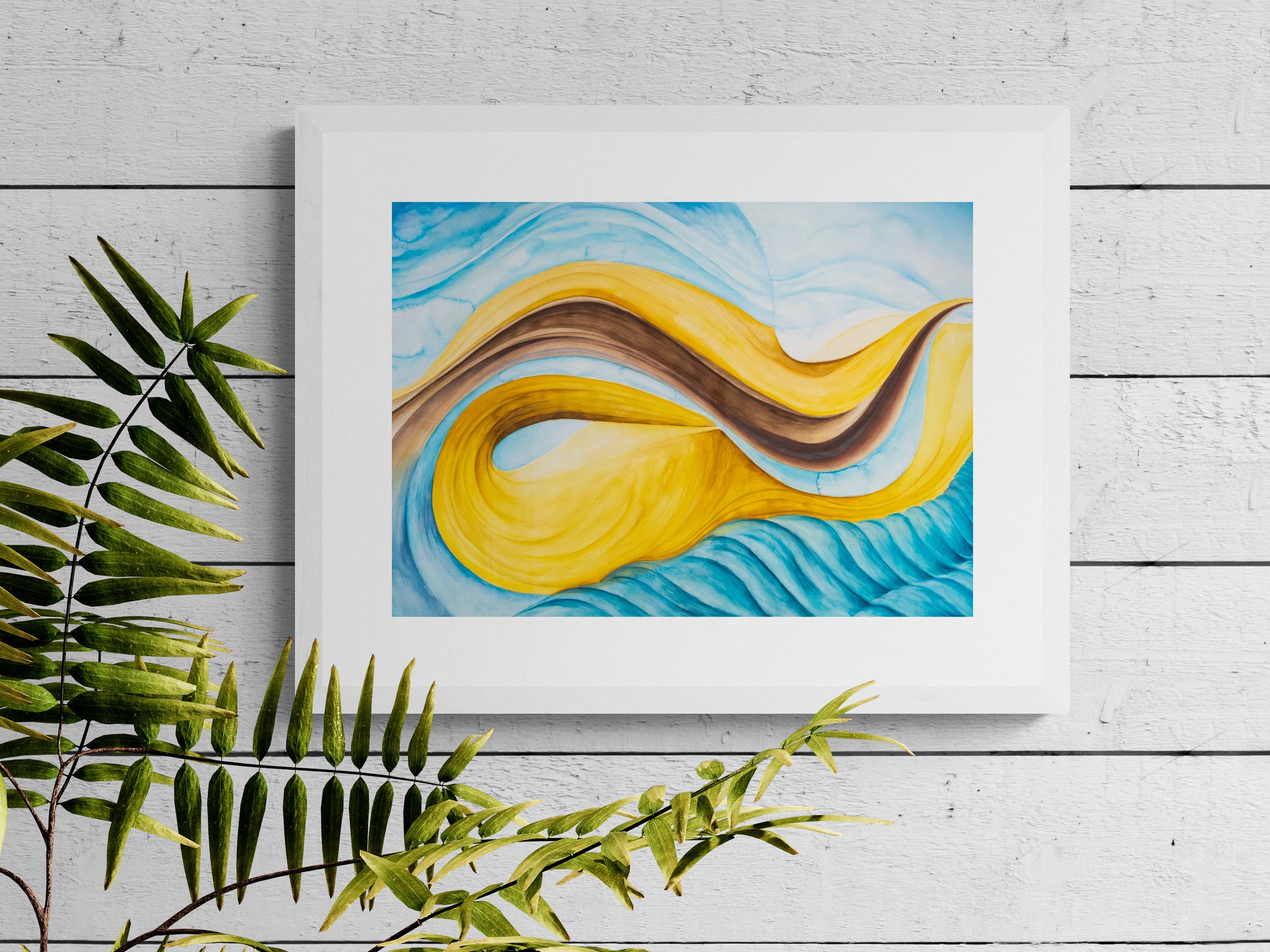
After the Storm
Having time to reflect on what ‘hope and recovery’ meant to me meant revisiting some of the themes I explore when I am feeling particularly low including storms and rough seas. I think this is because the weather is an unpredictable force that I can’t control, and sea storms are especially ferocious and turbulent.
I had taken inspiration from a painting which had an impact on me when I was feeling low: Two English Ships Wrecked in a Storm on a Rocky Coast by Willem van de Velde the younger on display in the Queen’s House, Greenwich. It depicts an intense and dangerous scene, some men have made it safely onto the shore, but the safety of those still holding onto the ships is uncertain. The whole canvas is shrouded in darkness, it could seem completely bleak and despairing if it wasn’t for the beam of light in the centre, a tiny shred of hope.
For this painting, however, I imagined the moments after the storm had cleared, stepping back onto dry land and embracing the warm sand on my feet on a sunny day. Since making the Mindscapes series back in 2021, I have been trying to understand the psychology of colour. Yellow is a colour that can symbolise warmth, happiness and optimism so I was certain that I wanted this to be a dominant colour in this composition, which would become the largest of the commissioned paintings. I also knew that I wanted it to represent a beach and coastline, viewed from the sea, so I started on a figurative painting and gradually abstracted it.
During the process of abstraction, I was integrating some of the movement from the storm but also included some rolling ocean waves.


Monday 18th March 2024 pm
”There were some things that I noticed as I was painting today. The main thing being that I was quite hesitant to paint at times. There were a few instances where all I could do was stare at it and try to figure out where it was going next . I was feeling a bit guilty about not painting and just looking. But looking is an important part of the process too. I realised the fear of making a mistake was holding me back, but the biggest mistake I could’ve made would be to let the fear stop me from doing anything.
There were a few mistakes made today, a few drips of paint spoiling the perfection. A few minor things that were easily fixed . I think I would actually like there to be some visible mistakes, but in this style off painting would anyone except me even notice them? It might even be the thing that someone liked about the painting.
At the moment, the mistake I’ve got in there is the shoreline. I didn't have the idea to recede it into the distance until quite late in the day, and I’d already blocked out where the sea was going to go. So the old shoreline will be visible under the new on. Something which would usually be called ‘pentimenti’ - Italian for ‘regret’, but I won’t regret it at all!”

After the Storm (2024)
Watercolour on Arches Aquarelle 300gsm paper
111 x 74 cm
On display at Nightingale Hospital Bell Street therapy centre
Monday 25th March 2024 am
”Today marks the beginning of a new week of painting. I’ve spent the past 4 days not looking at what I’ve done so far (as much as possible) in order to freshen my perspective.
So the next painting will be the light through the trees in the forest. The soft blues and greens will hopefully have a very calming effect. With the theme of hope and recovery I don’t think I can approach these paintings in the same way as the minds capes. The mindscapes were not really based in reality at all - I was just using painting as something to do while I was depressed and my feelings were quite hopeless - I had barely even considered recovery at that point. I just wanted to get by and painting was helping me to do that, it was a distraction and something to pass the time. It made heavy thoughts a bit quieter and it was something just for me.
But as I began to recover, I started to feel more open, hopeful, confident, and less fearful. I then realised that I didn’t want my art to be about being depressed. I don’t want to be defined by my depression, and I’ve since looked for other ways to express myself.
Therapy has opened up new realms of possibility for my art, since I’m not so consumed by depression now. So these paintings for Nightingale are not minds capes at all - they are conceptual paintings in their own right, they are minds capes that have been allowed to mature, grow and realise their potential. Which is also exactly what therapy has done for me. ”

A Failed Painting
Just as it was all going so well, I started work on the final painting of the commission. I had already made some sketches and was eager to get stuck in. As I sketched the composition on the huge page, I started to feel completely dissatisfied with it. But despite this, I continued with the plan.
It was becoming difficult to paint and I was getting increasingly frustrated. What was wrong with it? The colours I had chosen felt cold, and the composition I came up with felt empty - not the warm and welcoming forest I was picturing at all. I kept thinking that I wouldn’t have time to start again, so I should just carry on. But the bitter feeling was boiling within me, I was taking my aggravation out on the painting and the brushstrokes were becoming more vigorous. I loaded more paint on my brush than I usually would and I was slashing the painting with it. I had to throw my brush down and walk away - I though I’d already ruined it.
Time away from the painting didn’t soothe what I was feeling, so when I returned, I ripped it into pieces. I felt somewhat better.


Wednesday 27th March 2024 am
”I know it will be a good painting when it’s finished, but the process is a bit like walking a tightrope; you can’t lean too far in either direction, but just trust that you’re not going to fall.
Although I I think I did have a bit of a fall on Monday. I was really excited about making the painting for the main reception, and escaping to the forest for hours, but as I was painting it I got a horrible feeling. The whole thing felt like it was against me, I wasn’t enjoying any part of it. It was making me slam the paint down, and overload it with water. The whole thing turned into a mess, and the messier it got, the angrier I became.
I managed to distract myself for long enough to clear my head and make a plan for how I was going to resolve this. I let my frustrated feelings guide me to a place that I actually want to be, and thought about how to put that into paint.
The funny thing is: I looked at the photograph I took before I slopped lots of paint onto it, and it was actually not bad, I could’ve just taken a break and came back to it.”
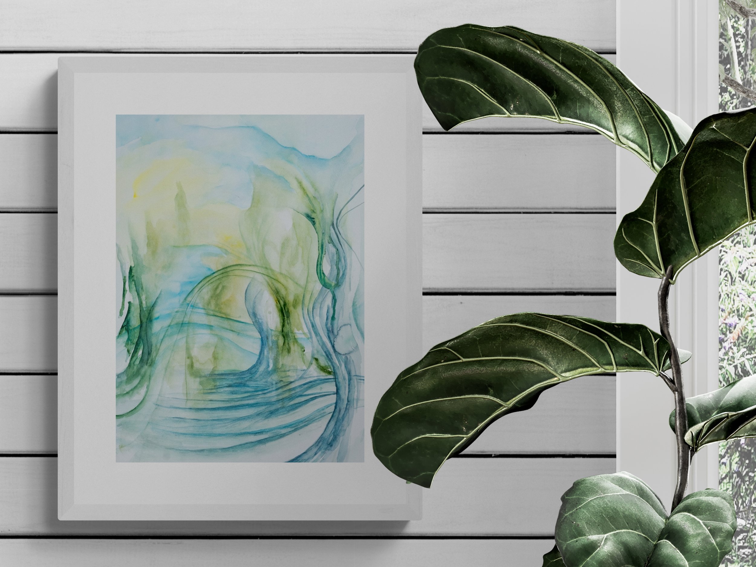
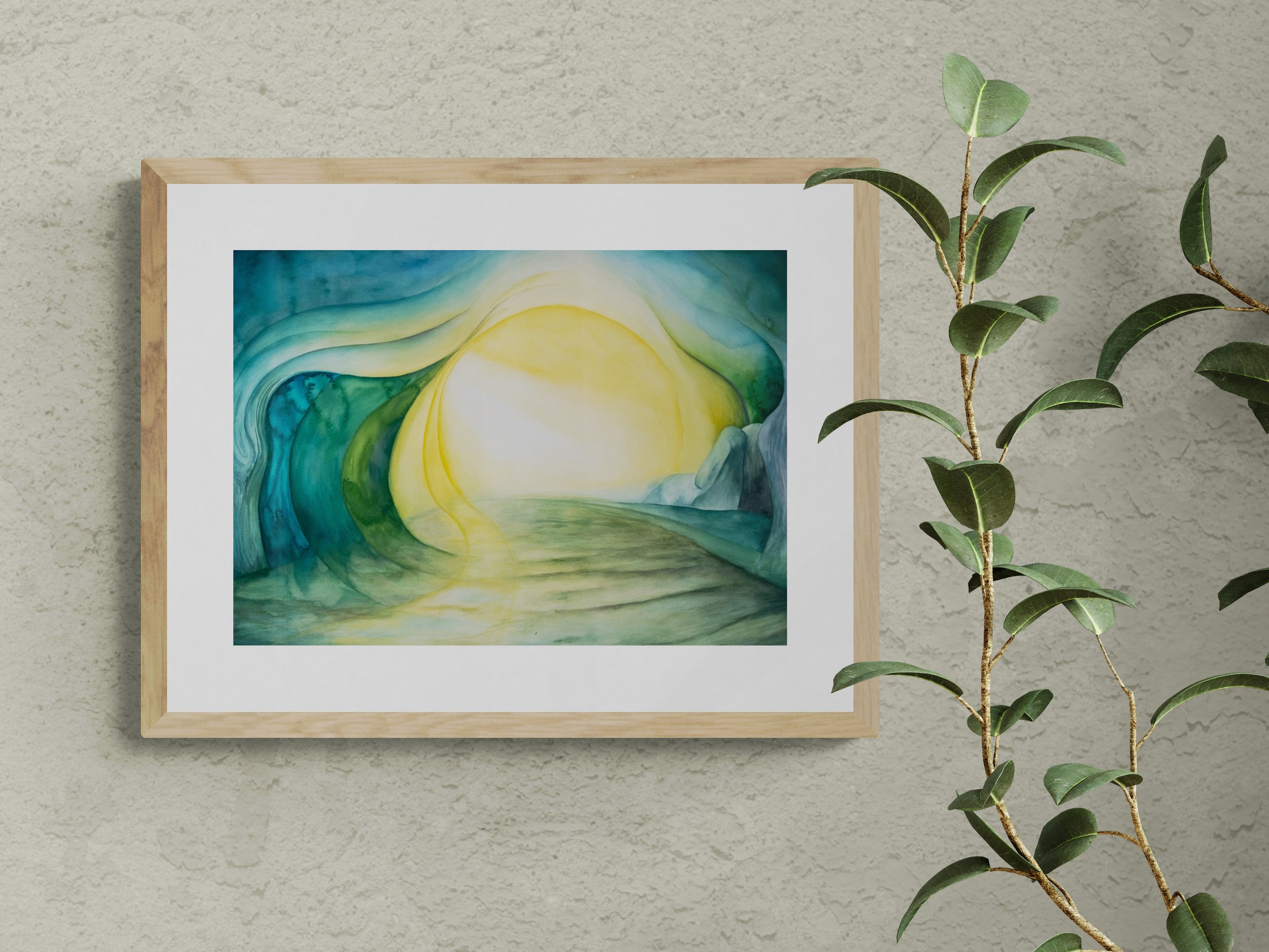
A Clearing
Now the painting could definitely not be used, and I was behind schedule. I was feeling a bit defeated, but I decided I needed to make a change to my plan as soon as possible. I did what I normally do when I’m feeling low and I need to paint; I listened to some music and I took my focus back to the memory of the forest. I realised that the yellow I was using was too cold, and the blue was too icy. I wanted to fill up the emptiness with sunlight somehow. After creating a couple of new sketches, I took some time to reflect on the theme of these paintings once again: ‘hope & recovery’. I remembered artworks that have reached me when I felt depressed and I was aimlessly roaming around art galleries, and decided to use these as inspiration for the composition of this final painting.
I revisited the painting by van de Velde (Two English Ships Wrecked in a Storm on a Rocky Coast) and another old favourite by J.M.W. Turner, The Decline of the Carthaginian Empire, on display in the Tate Britain - I felt like I could bathe in its sunlight, and it allowed a temporary escape from anxious thoughts.
I could spend a lot of time looking at these two paintings, for different reasons. It just goes to show how the arrangement and combinations of colour on canvas can be so powerful. Although I never felt I would ever be able to paint like these artists, developing my own process of painting and switching off for a bit provided the same calming effect as looking at their artworks.
Restarting this painting with a deadline looming was very anxiety inducing, I was worried I had made a huge mistake. After a while of painting, I realised how much more gratifying and relaxing this new composition was for me. Like reaching a clearing in a forest, I felt less restricted, more open and able to think clearly again. I could let the pressure off and actually enjoy the process of making the painting, and imagining myself in the landscape.


Wednesday 27th March 2024 pm
”Today I imagined myself wandering through a thick forest, in awe of the majestic tall trees that hug the space around me. I am enclosed and safe, but an opening through the leaves above reminds me that I am free. The sun gleams down to me and the light dances from the delicate vibrations of the rustling branches.
The painting has provided an escape into a landscape that is not real, but it has a feeling of a memory. Each time I paint, I am going there -that’s how I hope people feel when they look into it too”
A Clearing (2024)
Watercolour on Arches Aquarelle 300gsm paper
108 x 73 cm
On display in Nightingale Hospital Main Reception
This commission for Nightingale Hospital was both a challenging and rewarding journey. Creating art as a therapeutic tool has always been important to me, and knowing that these paintings could play a role in the recovery of others was a humbling experience. As I reflect on this process, I am reminded of art’s ability to connect us, even in the most challenging times.
Wednesday 17th April 2024 pm
”Completing this commission has given me the opportunity to reflect on how far I've come, and I can now happliy say that I am making art that I never thought possible 3 years ago. So I am really grateful for the opportunity and I hope these paintings can inspire someone else in a similar way.”
A Note from Lauren Phillips, Nightingale Hospital:
”It has been the most special project being able to commission local Southeast London artist, Sarah Emily Shaw, to create some pieces for Nightingale Hospital. Sarah created a series of paintings in 2021 depicting her experience of depression, medication and art therapy which is what these three paintings are based on.
Each piece is beautiful and tells a different story but my favourite piece would have to be the one leaning against the couch titled ‘A Clearing’. This piece will live in our main reception space, being seen by each and every patient who walks through our doors.
To me, it shows the journey that our patients go through in treatment. In the forefront with the dark greens it feels like danger, uncertainty, despair. Walking into a hospital is undoubtedly a scary decision. Our patients are coming in during some of the hardest times of their lives and it would be wrong to not acknowledge that pain. But the path leading to the sunlight is the hope that we want to instil for our patients and the difference that evidence-based treatment can make. They might not be able to see it at the time, but similarly as is depicted in the painting, the sunlight still reaches the dark parts of the painting, and our lives.
A sincere thank you, Sarah. You have poured your heart and own story into these paintings and I know they will have such an impact for every person who sees them.”
Lauren Phillips
Marketing and Business Development Manager, Nightingale Hospital
'Balance' Fine Art Print
Fine Art Abstract Landscape Print of an original Watercolour by Sarah E Shaw.
This painting was made as part of a series commissioned by Nightingale Mental Health Hospital. You can read more about it here:
PRODUCT DETAILS
This art print is made on high quality 300gsm textured matte paper.
Print Size: A3 | 29.5 x 42cm (11.7 x 16.5 in)
Carefully packaged in a recycled cellophane bag and delivered in a rigid card envelope (not rolled).
Frame not included.
Thank you for supporting my shop.
Sarah x
Fine Art Prints
‘Exploring Possibilities' Fine Art Print
Fine Art Abstract Landscape Print of an original Watercolour by Sarah E Shaw.
This painting was made as part of a series commissioned by Nightingale Mental Health Hospital. You can read more about it here:
PRODUCT DETAILS
This art print is made on high quality 300gsm textured matte paper.
Print Size: A3 | 29.5 x 42cm (11.7 x 16.5 in)
Carefully packaged in a recycled cellophane bag and delivered in a rigid card envelope (not rolled).
Frame not included.
Thank you for supporting my shop.
Sarah x
'After the Storm' Fine Art Print
Fine Art Abstract Landscape Print of an original Watercolour by Sarah E Shaw.
This painting was made as part of a series commissioned by Nightingale Mental Health Hospital. You can read more about it here:
PRODUCT DETAILS
This art print is made on high quality 300gsm textured matte paper.
Print Size: A3 | 29.5 x 42cm (11.7 x 16.5 in)
Carefully packaged in a recycled cellophane bag and delivered in a rigid card envelope (not rolled).
Frame not included.
Thank you for supporting my shop.
Sarah x
'A Clearing' Fine Art Print
Fine Art Abstract Landscape Print of an original Watercolour by Sarah E Shaw.
This painting was made as part of a series commissioned by Nightingale Mental Health Hospital. You can read more about it here:
PRODUCT DETAILS
This art print is made on high quality 300gsm textured matte paper.
Print Size: A3 | 29.5 x 42cm (11.7 x 16.5 in)
Carefully packaged in a recycled cellophane bag and delivered in a rigid card envelope (not rolled).
Frame not included.
Thank you for supporting my shop.
Sarah x
Thank you for supporting my shop.
Sarah x